FoodComa
A Lonely Planet app to help travellers finding the best local food
User Research, Information Architecture, Wireframes
Timeline
Jan. 31 - Mar 9, 2020 (8 weeks)
My Role
In the team of 4, I led the UX research activities including conducting user interviews, competitor analysis, and iterating wireframes
Tools
Figma
Brief
Lonely Planet is looking for a digital solution that would be the companion piece to its existing products and mainly targeting Gen-Z backpackers (Ages 18–24) & millennial travellers (Ages 24–35). Essentially, the most important thing we needed to get right, was to create a solution with lasting utility, that would still be relevant to travellers even in the future.
Overview
We came up with a dish based app “FoodComa”, which helps users get inspired, build a list of dishes that they want to try, add and share dishes with their friends and avoid language barriers at restaurants.
Due to the time limitation, we ended up with detailed wireframes and the entire user flows. The UI Design will come later.


01. Empathy
We start to empathise our users, we did hours of desk research about Lonely Planet and their current products and services, feedbacks from users, then went for stakeholder interview. After that, we started to looking up travel habits of Gen-Z-ers and Millennials for user interview.
After visiting 5 youth hostels and several popular hangout spots, we were able to talk to 25 travellers and received abundant insights.


We noticed that the topic of food was mentioned by more than 80% interviewees. After synthesising the interviews, we discovered that there are 4 main pain points regarding looking for food during travel.
Food is the second highest priority on a trip in terms of spending.
There are too many restaurant options and this can lead to decision fatigue.
It is hard to find the authentic food options that only locals know about.
Language barrier poses a problem when ordering food.
We saw 3 different behaviour types emerged from the user data, that became 3 personas: Ines, as our main user, the planner; Jorge, the oversharer, and David, the improvisor.


02. Concept
We came up with FoodComa, which is a native app focusing on helping travellers to find local dishes.
Our user research indicated that users get overwhelmed with the amount of restaurant options that they en- counter. This led us to focus on dishes and create a simple mechanic wherein users can browse dishes to get inspired.
Here are the 4 goals for the app:
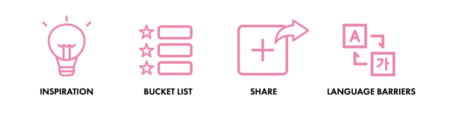
To get people inspired to try new things.
To be able to easily build lists of dishes they want to try as a sort of bucket list.
Traveller to traveller connection by sharing their food experiences.
To help with avoiding language barriers when they are travel abroad.
03. Ecosystem
We mapped out Lonely Planet’s ecosystem of products and services as an easy way to understand and visualise Lonely Planet’s offerings and to see if any areas of opportunity presented themselves.
We decided to divide Lonely Planet’s presence in three slices:
Pre Travel
This is the phase before the trip takes place, where the inspiration and planning for the trip happens. Within this area we further sub categorised based on the activities users perform. These are : choice of destination, trip related research and some booking activities.
During Travel
The user is now in the exploration phase. This phase includes some further bookings, finding activities to do, figuring out what to eat and where, connecting with other travelers and locals, navigation and using social media to share updates.
Post Travel
The last phase is related to what the user does after the trip ends. In this phase, the user will use social media to share experiences, leave reviews and share stories about their trip.

Looking into The Lonely Planet’s ecosystem, we realised that our potential solution, being related to finding food, fit within the “during travel” phase. Even products from Lonely Planet had covered this area, they were guide books and recipe books, which didn’t relate to the ever changing needs and wants of Gen Z backpackers. Our research also further indicated that Gen Z travellers were looking for more authentic traveller to traveller connections.
Our solution would have the benefit of being digital and would help travellers find and share recommendations of food to try.
04. Competitors
To further understand the travel market as it stands today and contextualise Lonely Planet’s place in it, we undertook a study of the competitors that Lonely Planet has. We looked at traditional competitors in the travelling guide space as well as more unconventional competitors that travellers also use to solve their travel issues.


From the analysis, we could see that while Lonely Planet still has the upper hand in terms of travelling guides, the overall market for travel problems to be solved has expanded, and competitors such as Tripadvisor and Booking.com have taken advantage of this by bolstering their booking services with travel information and editorial content. This makes them a more attractive overall experience.
This led us to believe that an unconventional and novel solution was required in order to give Lonely Planet something that would truly connect with the target audience.
05. Features & Functionality
To help us identify the features that would be core to the MVP (Minimum Viable Product) of the application we first listed out the features on a per page basis. Each feature was rated based on Importance to User / Importance to Business / Technical Complexity. It helped us define the feature’s position on one of 4 Quadrants, such as features in 4-Quadrant-Table were with high user needs and business importance, as well as low technical complexity, so that they were necessary in MVP.
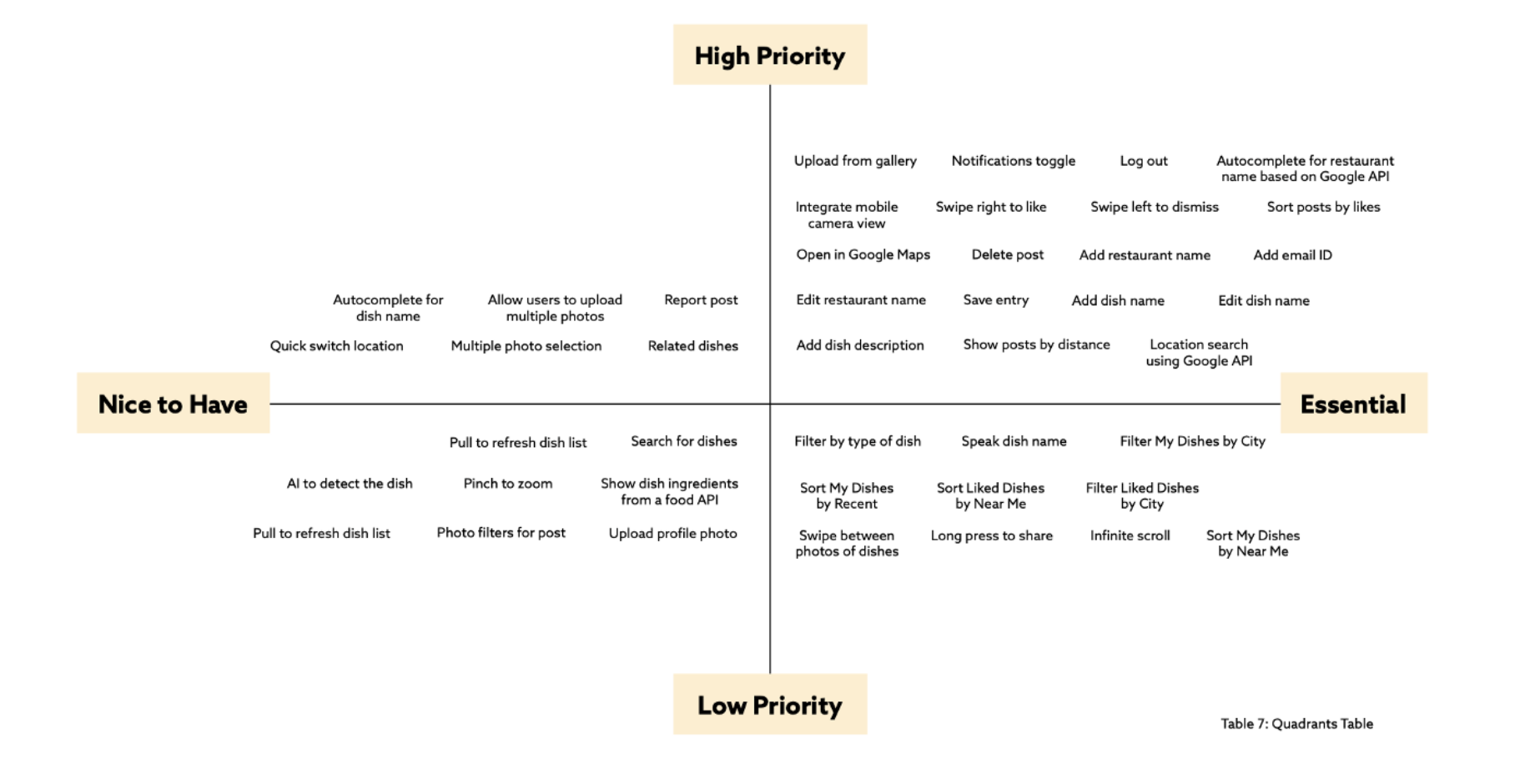
The entire feature & functionality Matrix is here.
06. Information Architecture
Card Sorting
We put the main features and content on cards and invited a user, within our target age group, to perform a card sorting exercise with us. This exercise helped us organise the information, decide the structure of the application and design the content and features of our app.

The user bucketed the cards into 4 groups and assigned labels as “Dietary Restrictions”, “Information”, “My Activity”and “My List”. The card sorter indicated that the categorisation should happen based on allergy preferences. This led us to create a filter that would have prominence on the home page.
She also indicated that the Nearby card belonged to both the information group and the My List group. This made us realise that it was necessary to show the distance of the food to her current location in both places. We decided on a map view to let users find nearby dishes as well as a distance indicator in the details view to help users make a decision.
Sitemap
Based on the feature & functionality matrix and the card sorting results, we created the sitemap for the app.
Primary Navigation

Utility Navigation

07. Wireframes
Our next step was to create wireframes to help visually understand the hierarchy and structure of the application.
After a few iterations, we added details to the wireframe and refined it until we had a clear picture of what worked for the users. Below are the final wireframes.

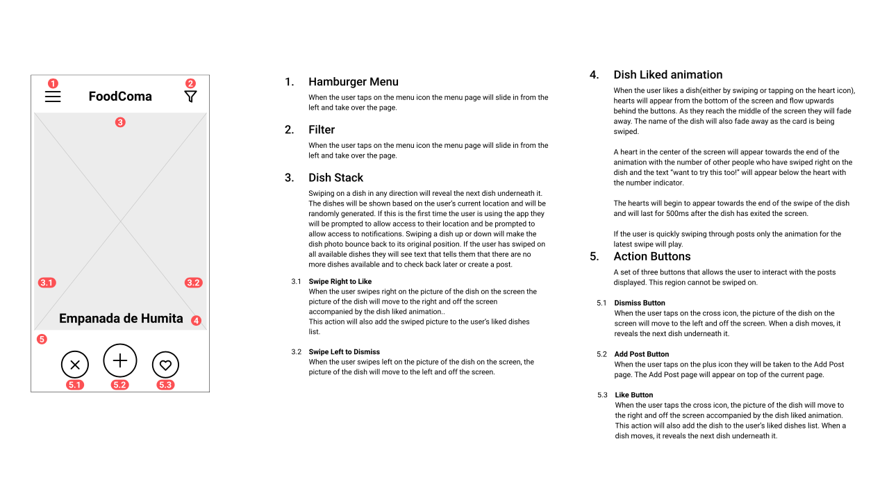
Annotation
Following this we added annotations to help capture the functionality and interactions of the wireframes
08. Conclusion
After analysing the market and realising that food could be a viable solution, we created FoodComa. A dish based app that helps users get inspired, build a list of dishes that they want to try, add and share dishes with their friends and avoid language barriers at restaurants.We believe it will be a valuable addition to the Lonely Planet’s ecosystem as it helps travellers find and share food recommendations, encourage a traveller to traveller connection, and Gen-Z will be happy to have on their phones. Click to view the entire document about the project.
Due to the time limitation, we ended up with detailed wireframes and the entire user flows of the app. The art direction and UI Design will come later.