Fluttr Recruitment Dashboard
End-to-end UX/UI Design of a B2B product
Interviews, Competitor Analysis, UX Design, UI Design, Usability Test
Timeline
Feb - August 2018 (6 Months)
My Role
As a Design-Team-of-One, I handle the entire UX research and design process, starting from the discovery phase and utilising methodologies all the way to creating user flows, wireframes till the detailed UI interfaces
Tools
Sketch, InVision, Zeplin
Brief
Fluttr is a talent acquisition and evaluation platform. On Fluttr the recruiters can not only check CVs, but also create challenges and personality tests to evaluate the candidates.
However, Fluttr weren’t successful at that moment. It was very hard to get new users because they didn’t understand the dashboard. The existing users were also not satisfied with it so that the churn rate was increasing.
Overview
It was one of projects when I worked at Fluttr. I designed the Fluttr recruitment dashboard including 1) job page with to-do-lists and CTA, 2) candidate card with candidate status and recruitment progress info, and 3) the filter & sorting system.
The new design was quite successful, Fluttr existing users liked the new interface and new users also understood it better. After releasing the new version for 2 weeks, the new register increased by 20%.
01. Test and Research
Usability Test
I started with usability test with the current dashboard. Below was the feedbacks from the testers.

So the biggest challenge was from the information architecture and visual presentation of the candidate card.
Stakeholder and User Interview
I interviewed Fluttr CEO, and 8 HR leads and recruiters from different companies, some of them were Fluttr users, and some were not the users but familiar with other management platforms.

From the interview, I understood that many recruiters spent too much time in figuring out the status of each candidate, sorting the best candidates, and managing tasks.
So, “How Might We help the recruiters to quickly check the status of the candidates, sort out the best ones from different aspects, and improve the task management?”

02. Competitor Analysis
To understand the recruitment platform market and the area where Fluttr is in, I studied the competitors and looked up new opportunities of Fluttr.
The common visualization of the recruitment progress and candidate status is to place the cards in a horizontal “funnel”. For the candidate card, “drag and drop” interaction mode is quite popular. What Fluttr could do differently was using different colors to distinguish status and evaluate categories.
03. Ideation
Here were my ideas for the job and candidate management dashboard:
1) Candidate cards need simplification. Design a funnel to visualize the recruitment status.
2) Intuitive and concise sorting and filter system.
3) A CTA with to-do-list to help each recruiter to manage the incomplete tasks.
04. UX Design
User Journey helped me understand how do the users reach “Waw” moment (when they complete all the tasks in the to-do-list). But which information do they need to see to get that moment? In Card Sorting session. I asked the testers “What categories do they prefer to see on the first page of the dashboard?”, “then next?”, and “How should all info of a candidate be structured on a candidate card?” Referring to the information from User Journey and Card Sorting, I created the User Flow and Sitemap for sketching the wireframes and prepare the copies.


05. Art Direction
The branding color is blue, representing trust and intelligence. I also chose some secondary colors which were easily distinguishable, used for status and the scores from evaluation on 5 different aspects.


Job Management
On the job page, recruiters can see the current number of applicants in each stage, as well as easy visible to-do list CTA.
06. Interface Design

Candidate Management
After clicking one of the job card, the user will go to the candidate management page. Recruiters can review the overall score and the candidate´s current status. Users can also simply drag and drop to move the candidate to next stage.

Filtering and sorting
Customisable filters are placed on top for easy and quick candidate searching. Candidates can be sorted by scores of different evaluation.

07. Conclusion
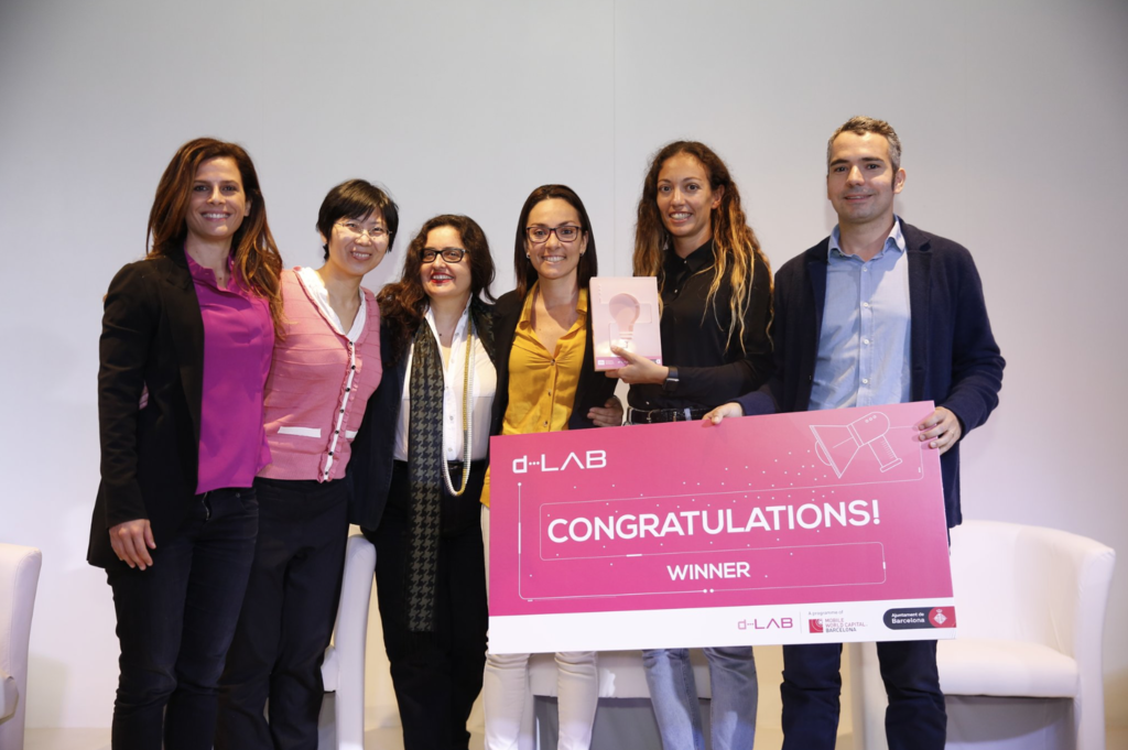
I redesigned the job and the candidate management page being as part of the core services of Fluttr product. The new design was quite successful, Fluttr users liked the new interface and new users also understood it better. After releasing the new version for 2 months, the new register increased by 20%. In 2018, Fluttr became the “d-LAB” for being the best solution for reducing gender gap, granted by Mobile World Capital Barcelona.
During working at Fluttr, I also designed the candidate detail cards, the page of creating/editing a challenge, and the page of assigning/evaluating challenges. Contact me if you want to see more work of mine in Fluttr.