Banner Editor of CloudBlue
Marketplace
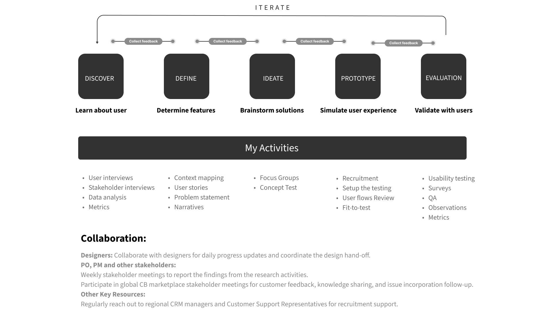
End-to-end UX Research study with Mixed-methods
Timeline
March - June. 2022 (3 months)
Methods
Desk Research, User Interview, Expert Review, Moderated & Unmoderated Usability Test, Survey
Tools
Google Meet, Userlytics, Google Form, Sketch,
Miro, Dovetail, PowerBI, Jira, Confluence
SUMMARY
About CloudBlue
CloudBlue is a marketplace platform for Cloud Service Providers and Resellers to sell and procure value-added Cloud products. Recognizing the unique needs of small- and medium-sized reseller companies, CloudBlue prioritises flexibility and self-started White-Label Marketplace experiences for users to enable them to establish multiple sales channels and personalise their online stores.
The Challenge
CloudBlue identified several oppoturnities to enhance the marketplace customisation experience: one of them is facilitating users showcasing their promotions and offerings on the storefront to attract more clients. Currently, user data indicates that only 25% marketplace admins create banner and manage them independently. This results in the decision for a redesigned banner editing tool to promote self-sufficiency, alleviate customer support workload, and enhance user satisfaction and loyalty.
My Responsibility
Spearheading research studies, planning, execution, synthesis, and delivering presentations and documents.
Closely collaborating with Product Designers and Managers from end-to-end, to uncover user needs, usability issues, and evaluate the new interfaces.
Managing participant recruitment, both internally and externally.
Results
The results of our redesigned interfaces have been exceptionally positive. In final performance tests, the new design has significantly addressed customer requirements and resolved key pain points. 59% of participants were able to complete tasks independently, achieving success rates of 80%, 92%, and 72% in tasks such as adding a new banner in multiple languages, navigating and editing CTA links quickly, and acknowledging status updates.
01. Situation
CloudBlue, a division of Ingrammicro, provides marketplaces for software Providers and Resellers to establish their own sales channels for selling and procuring value-added Cloud products. Within this ecosystem, small- and medium-sized reseller companies (SMB Partners) play a crucial role, serving as integral components of the customer landscape.
CloudBlue prioritizes providing users with flexibility and self-initiated customization experiences within the Marketplace. However, Customer Success Management (CSM) teams at Ingrammicro in the NAM and EMEA regions continue to receive numerous tech support requests from reseller users, leading to increased workload.
In Q4 2021, the CloudBlue product team strategically opted to delve into user needs, identify the most challenging moments, and revamp the entire configuration and customization tool. I participated in the high-level research on the Configuration and Customization journey, as the initial discovery phase. Previous studies uncovered a list of critical pain points along the journey, one of which involved showcasing marketing materials like promotions and special offers on the storefront.
02.Project Proposed
In February 2022, the Marketplace product team prioritised the pain points, and decided to focus on the area of managing marketing materials on the storefront. According to the customer tech support report in 2021, a frequently performed task that required assistance, was that the users couldn't effectively create and manage banners to showcase promotions and offerings. So the product team initiated this project in March 2022 by recognising the pivotal role of Banner Creation and Management in increasing visibility for promotions and new products.
My role
In my role as a UX researcher supporting the entire Partner Marketplace, I've already played a key role in the initial discovery phase. Subsequently, I shifted my focus to leading the project aimed at redesigning the Banner Editor.
Throughout this endeavor, I have taken charge of all UX research activities, spanning from initial ideation to evaluating new design iterations. Utilizing a combination of qualitative and quantitative methods, I collected and synthesized data to derive actionable insights, thus guiding iterative improvements.
03 Actions
3.1 Kick-off
3.1.1 Stakeholder Meeting
First, I initiated the stakeholder meetings with the Product Designer, Product Manager & Owner of Reseller Marketplace, as well as the CSM leads in AMER and EMEA regions to gather information and resources from them, to understand which problem we need to tackle, their desire and expectation from this project.
3.1.2 Target audience
As our target area is marketing material management, the user roles include marketing managers, web designers, or content designers. They require a user-friendly banner editor with intuitive interfaces, facilitating seamless creation, editing, and management of banners on their storefront. This ensures they can effortlessly update promotions to keep their storefront content current.

GOAL
Design a new user experience that is self-explained to the users, allowing them to easily customise and manage banners independently.
Improve user satisfaction and engagement with the new tool.
Develop new ways to maintain good relationship between the customers and Ingrammicro.
3.1.3 Research Plan
I made the research plan of coming 3 months (see below) after discussing the priority and capacity of the designers and PM, and reached an agreement on the plan with all stakeholders and relevant teams.
3.2 Discovery
3.2.1 Desk Research
To assess the performance of the current banner editor over time, and determine the key metrics to measure the success of the design, I gathered information and data from various sources, including CSM reports, interviews from relevant people, Jira Tickets related to feature requests, as well as user data of the marketplace platform from PowerBI.
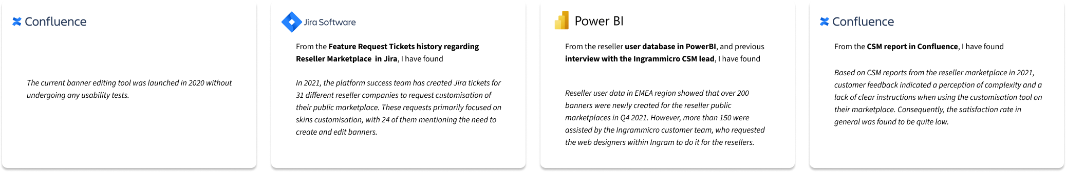
After analysing these existing information, I have obtained the following key findings:
The current banner editor tool has never been tested since it was released in 2020.
The common tasks involve creating new banners in multiple languages, regularly editing and republishing the existing banners, especially updating the Call-to-Action (CTA) link, typically on a quarterly basis.
In 2021, only 25% of activities regarding banner creation and management were operated by the resellers themselves.
Over 80% of new onboard or existing resellers relied on their provider's customer support service to complete the above tasks, indicating that only 20% of reseller marketplace admins attempted to perform these tasks independently.
A low satisfaction with the marketplace customisation tool in general. Their primary obstacle was the complex navigation system and the need for clear guidance on the interfaces.
3.2.2 Key Metrics
The evaluation of the new design's key metrics, according to the desk study and the study goal aligned with the stakeholders, should focus on:
Percentage of users who are able to create and edit banners using the banner editor independently.
The task success rate for completing each task without external guidance
The satisfaction rate of users after utilizing the tool
3.3 Define
3.3.1 User Interview
To dig into the cause of frustration among resellers and gain qualitative insights, I conducted 1:1 interviews with 5 content manager and designer (see persona) from the reseller companies with experience using the banner editor or who submitted the requests.
During the interviews, my primary focus was to understand their frustration for creating, editing, and publishing banners and detect the reasons behind them.
I invited them to provide a walkthrough of the interfaces they used, walking me through their actions along the way, and explain the difficult moments and the reasons behind.
I analyzed all the transcripts within Dovetail, systematically labeling quotes related to pain points, reasons, and user desires. So that I could generate primary user stories and identify the essential needs that require attention to focus.
3.3.2 Define Problems
After the interview and analysis of transcripts, I generated the user stories and pain points to share with the stakeholders.

3.3.3 User’s unmet needs
The new banner editor should meet the following users needs as following. During the weekly meetings with stakeholders, I have shared valuable insights and feedback to guide the designers in generating new concepts.

3.4 Ideation
3.4.1 New Concept
The design team has provided a new sketched concept that incorporates the insights I previously shared regarding the user needs.

This concept aims to address the requirements discussed and align the design with the identified user needs, by incorporating the following features:
Concentrated editing areas into the sidebar and allow the users to edit contents and set the languages sequently
Highlighted CTAs on both sidebar and above the banner
The status indicator above the banner.
3.4.2 Expert Review
To rapidly validate the concept, I have scheduled expert review sessions with 5 web design specialists from Ingrammicro, who used to create banners for the reseller customers.
They were asked to complete a series of common user tasks and actively encourage them to provide valuable feedback based on their experiences. Below are the results, including the ideas that they liked and their recommendations:

I presented the insights to the stakeholders along with my recommendations as following for the coming iteration:
1) Incorporate a feature that enables users to add text, CTA link and images directly over the banner
2) Enhance the visibility of the Call-to-Action (CTA)
3) Improve the hierarchy of the sidebar content.
3.4.3 Follow Up
The stakeholders were largely convinced and open to adopting most of the recommendations. However, they made the decision to not implement the feature of adding text over the banner, as they prioritized the considerations of the development team.
To strengthen the importance of usability issues and convince the stakeholders to reconsider the priority, I decided to provide more substantial evidence and validate the hypothesis, so conducting formative usability tests with real users becomes essential.
3.5 Evaluation
3.5.1 Formative Testing
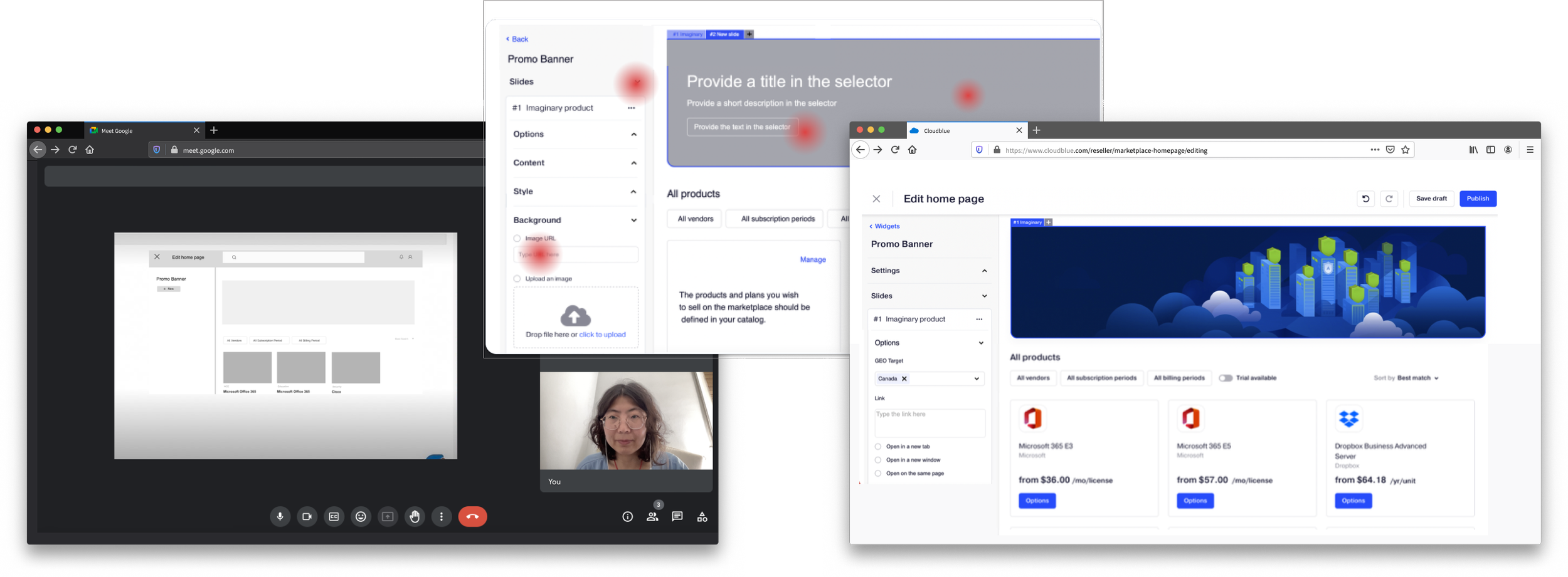
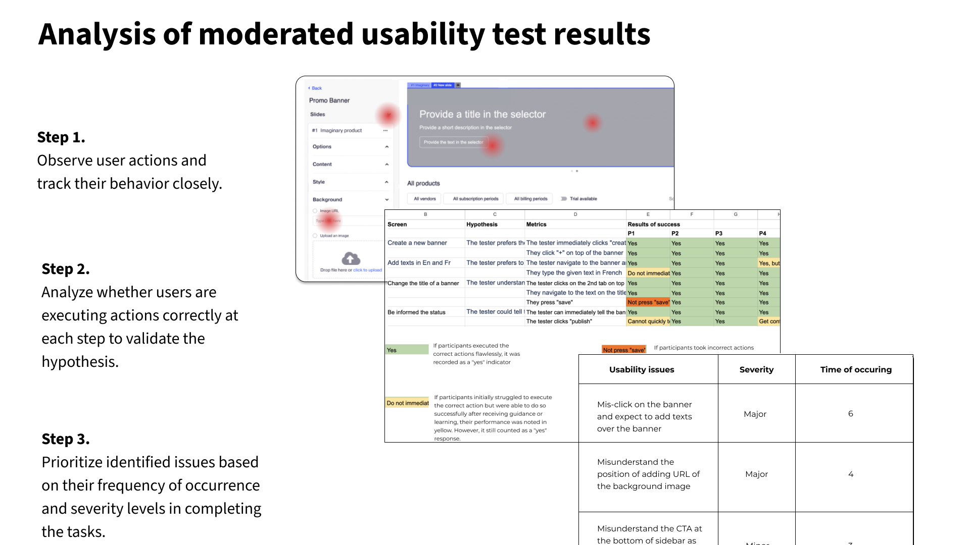
It is crucial to test users' understanding of the interfaces including critical functionality and contents. To achieve this, I conducted 9 sessions of moderated usability tests after the completion of wireframes with a certain level of interactivity. The participants are Marketplace Admin, Marketing Content Manager and Web Designer recruited from reseller companies affiliated with Ingrammicro.
Below are the screenshots of the mid-fi wireframes with key elements, functions, information on menu items with certain level of interactivity, process to discovery and prioritise the usability issues, and a summary of the issues with recommendations. See the personas of content manager, designer and Marketplace admin.

The mid-fi wireframes with key elements, functions, information on menu items with certain level of interactivity for testing
I setup the task scnearios as following:
Adding a new banner in multiple languages
Navigating to an existing banner and editing the CTA link
Acknowledging the status of a saved banner and publish it
Percentage of participants who could complete the tasks, and main issues sorted by their frequency of occurrence.
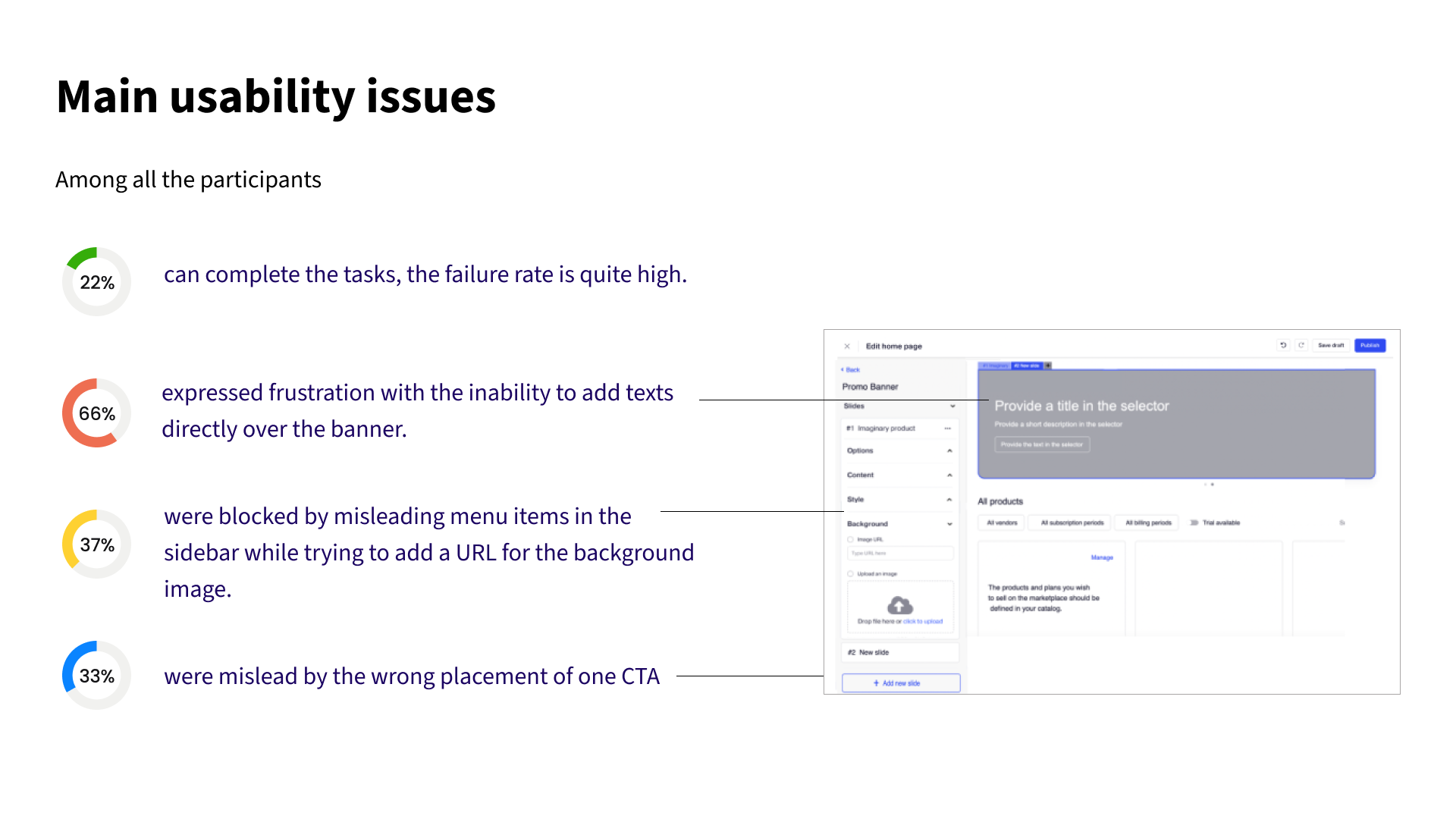
Design iteration recommendations based on main usability issues
The process of analyzing the test results, synthesizing the identified issues, and implementing the recommended solutions

3.5.2 Follow Up
In the stakeholder meetings with the PM and PO, I have been diligently tracked and incorporated user feedback. Especially the implement the feature of adding text over the banner, which has been remarked as a critical issue for the new experiences.
Finally the stakeholders were convinced and agreed to incorporate this feature into the next iteration. Therefore the major issues highlighted above have been successfully resolved during the high-fidelity prototyping phase.
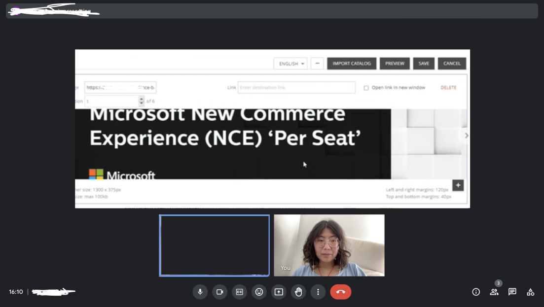
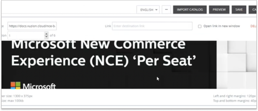
3.5.3 Summative Usability Testing
After incorporating the feedbacks from moderated usability testing, the designer added detailed UI elements to resemble the end product and test the performance.
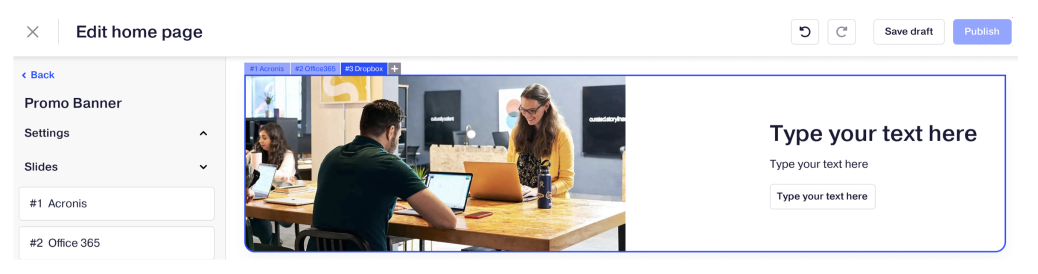
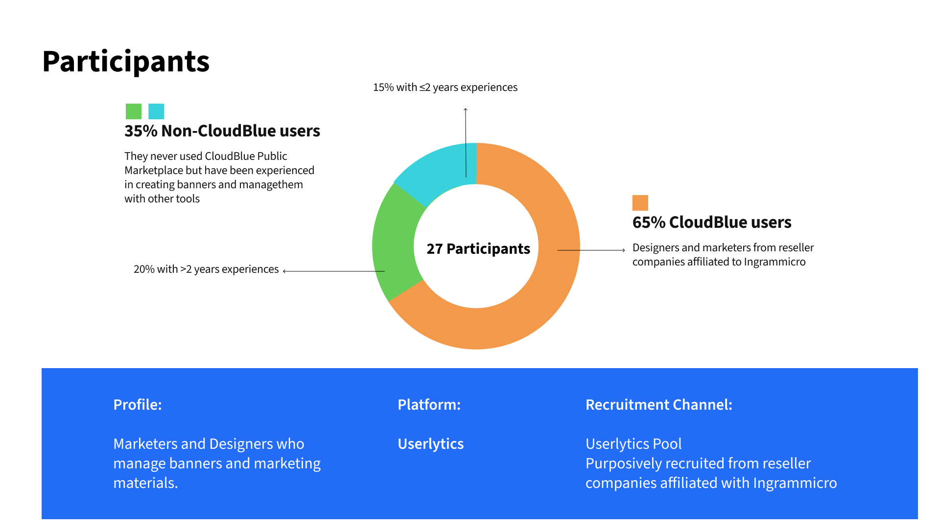
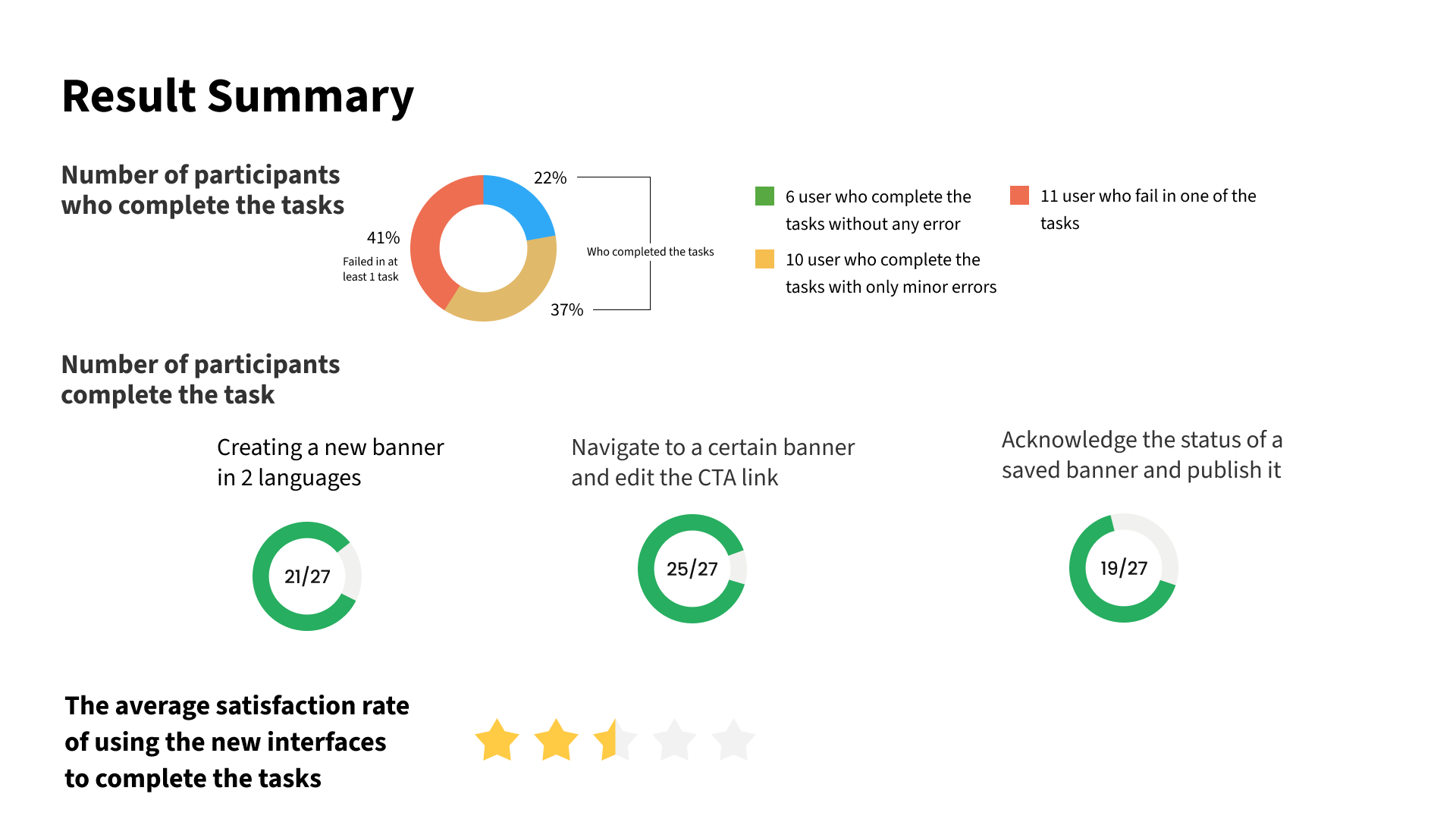
I used testing platform to run unmoderated test with the same scenarios as in the formative one. Below are the screenshots of the setting of the tests, profile of recruited participants and the recruitment channels, as well as a summary of the results in terms of users who can complete the task, the task success rates and the user satisfaction rate, which were the key metrics measured and compared to the previous design.
Participant profiles and recruitment strategy: For the usability testing, we have included participants with the following profiles:
65% of the users are CloudBlue users recruited from newly onboarded reseller companies of Ingrammicro or companies that have been partnered with Ingrammicro for a couple of years.
35% of the users are recruited through the Userlytics Platform and have no prior experience with CloudBlue. These participants have never used CloudBlue before.
By including both types of users, we aim to minimize any potential bias resulting from participants' familiarity with the interfaces or their habits of creating banners using previous tools. This approach allows us to gather diverse perspectives and obtain unbiased feedback on the usability of the interface.
The results of our redesigned interfaces have been exceptionally positive. 59% of the participants can complete all the tasks independently.
The task success rates achieved are as follows:
Adding a new banner in multiple languages: 80%
Navigating to an existing banner and editing the CTA link: 92%
Acknowledging the status of a saved banner and publish it: 72%
The overall satisfaction rate stands at 3.5 out of 5, indicating a relevant positive attitude towards interacting with the interfaces.
04 Results
The results of our redesigned interfaces have been exceptionally positive. In final performance tests, the new design has significantly addressed customer requirements and resolved key pain points.
59% of the participants can complete all the tasks independently.
The task success rates achieved are as follows:
Adding a new banner in multiple languages: 80%
Navigating to an existing banner and editing the CTA link: 92%
Acknowledging the status of a saved banner and publish it: 72%
The overall satisfaction rate stands at 3.5 out of 5, indicating a relevant positive attitude towards interacting with the interfaces.
However, the satisfaction rate remains relatively low. The attached survey from the usability test reveals that some users encounter difficulties in recognising certain information on the sidebar and the status of a banner. This identifies an opportunity for improvement in the next release.
05. Impacts
5.1 To the product
The new design concept and its subsequent iterations have been developed through consultations with me by incorporating insights gathered from user interviews, expert reviews, and usability tests.
The redesigned interfaces have achieved a remarkable improvement in key information recognition, status recognition, and overall flexibility and efficiency, allowing users to complete tasks more effectively. As a result, the percentage of users who complete the tasks and the success rates have impressively tripled compared to the previous design.
AFTER
In terms of user performance, both the number of users and task success rates have significantly tripled when compared to the previous design in the main task scenarios.
The new banner editor Addresses the previous issues through the following solutions.
Consolidating editing areas within the sidebar enables users to edit content and set languages sequentially.
Adding multiple highlighted CTAs as various entry points
Incorporating a status indicator to display the current status and prevent errors.
BEFORE
Previously, only 20% of reseller customers completed tasks without support, and 25% of banner creation and management tasks were done by themselves. This resulted in low system usage and satisfaction rates.
There are a series usability issues:
The users cannot recognize the status of the banners.
It is difficult to navigate to a certain banner that they need to edit, especially when they have created many of them already.
The user cannot add texts over the background image, they only can insert an image with the text, that consume a lot of time to design the banner.
The CTAs are hardly found and navigated to

5.2 To the organisation
I have engaged in close collaboration with cross-functional teams to delve into issues and uncover design opportunities, while also pinpointing friction points throughout the design process. By consistently addressing usability concerns, I have heightened awareness among key stakeholders, particularly within the Product Team, regarding the pivotal role of UX Research and its amplified impact on informed decision-making within product design.
5.3 To the customer
To carry out both formative and summative evaluations, I enlisted over 20 new users who had no prior experience with usability testing. Guiding them through the process, they showed interest and continous support willingness. In doing so, I played a role in sustaining positive customer relationships, as well as enhancing their engagement with the product.
06. Retrospectives
Upon concluding the project, I invited all team members, including 2 Product Designers, 1 Project Manager, 1 Product Owner, and my UXR Manager, for a comprehensive retrospective session. This session aimed to assess both the successes achieved and areas for improvement, with a keen focus on enhancing project-oriented perspectives to improve our current design processes.
6.1 What went well
Our team maintained a commitment to the user-centric design process and adhered to a synchronised schedule, ensuring alignment with each other's priorities, urgent needs, and addressing blockers effectively. My personal accomplishment lies in consistently monitoring the progress of resolving usability issues and swiftly mobilizing testers to conduct rapid testing when necessary.
6.2 What need to be improved
Usability testing remains a time-consuming aspect of the process, especially when seeking quantitative feedback, leading to delays in progress. This challenge often arises from misalignment with key individuals within customer companies and their slow response times from the customer companies. Moving forward, we need to stay closely collaborating with the customer success team, better manage the candidate pool and pilot groups, along with enhancing our incentive program to encourage greater participation.
In addition, from a higher level, previously the performance of the product wasn’t systematically tracked, so that we lacked baseline data positioning at the beginning of the product, although in the next stage of the project we sent SUS (Score of usability satisfaction) and CSAT (Customer satisfaction score) questionnaires to users to quantify their usability, satisfaction and adoption of current new products, but we still need to conduct detailed measurements for each version launched.
Related Projects

Data-driven Web Design
Landing Page for identi App Campaign
A campaign landing page designed assisted by Analytic tool and following a data-driven approach
UX Research & Product Design
Fluttr Recruitment Dashboard
Research and Product Design of an all-in-one Recruitment CRM platform

UX Research & Product Design
Collab
A virtual office platform for coworkers to remain social activity during COVID-19